Naan Bar is an Indian restaurant located in Valletta, Malta. Their restaurant is a true experience with an open kitchen and a private dining area. The new restaurant in town needs a new website that shows that true experience on the web. The challenge was to include a booking functionality and the menu on the best possible location on the website.
• information architecture
• userflows
• wireframing
• usability rules
• visual design
• developer handoff
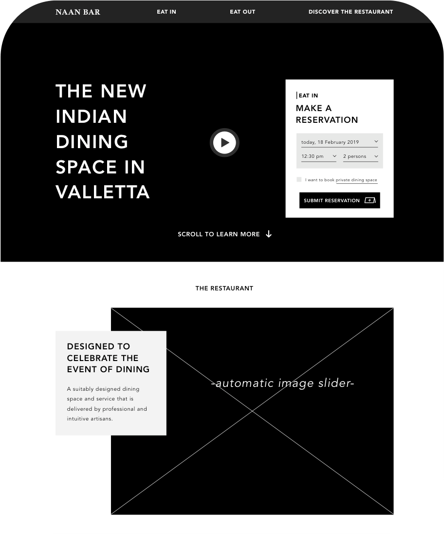
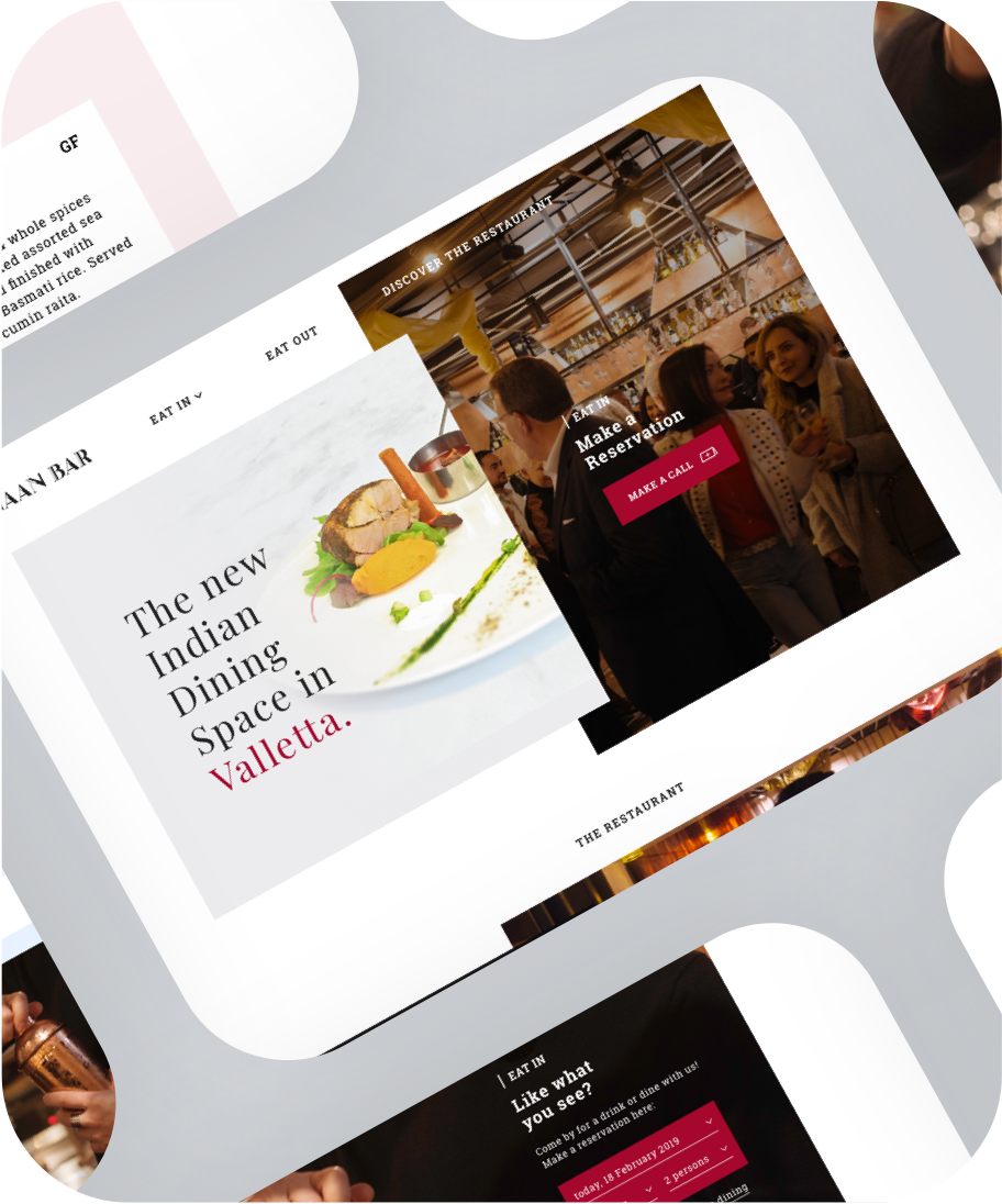
The booking engine on the website is one of the two main features. The accessability of the engine is great: it’s the first thing you see when you land on the home page. The second important feature is the fact that people might want to discover the restaurant first - since it’s a brand new one. Therefore, the website is divided into an eating in section, an eating out section (delivery) and a discover the restaurant section.
Large images of shots from the restaurant and small blocks of information excite users to learn more and eventually visit the restaurant.
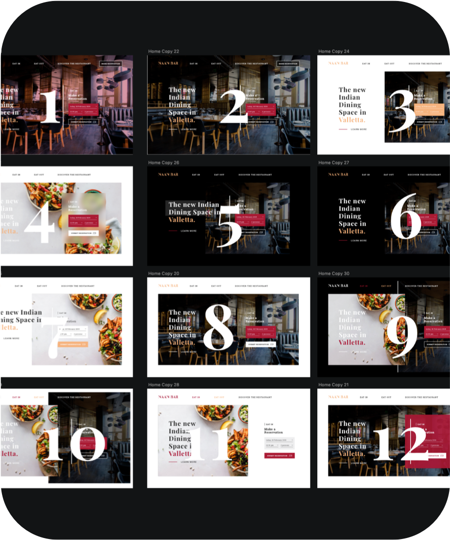
While trying to create the best first impression, a lot of chatting happened between my colleagues and me. The 12 shots on the right (out of 50+) were voted best in test.
We decided to go for a combination between no 10 & no 11 to keep it clean and modern. A white background works good if you want a minimalistic and clean looking design.
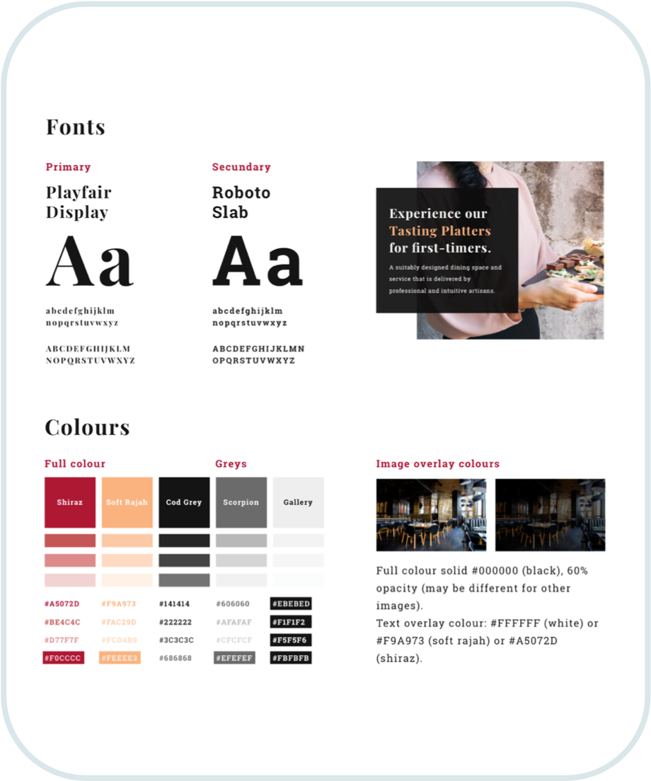
Serif fonts like Playfair Display and slab fonts like Roboto bring a luxury & classic feeling. Roboto Slab is a font that’s often easy readable. We decided to increase the character spacing to achieve an even higher level of readability & scanability of words.
I used the colours Oisin (my colleague who did branding) came up with and slightly tweaked the saturation for the web. I think these colours could be associated with Asia/India in combination with the slab font.
Image overlays are an important design element to keep in mind. Figuring a fixed colour-opacity level, text as overlay is always readable.
I wanted the design to be a ‘gallery view’. The fixed white border around the edges of the browser window caters for that desire.
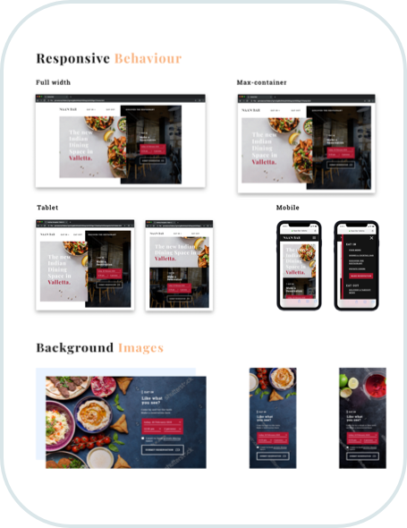
Also, no website exists only on desktop screens nowadays. Creating screens for different browser and device widths is essential for a usable website.
Last but not least, I figured that text elements should never be superimposed over the ingredients. That’s why images adapt on every screen size.
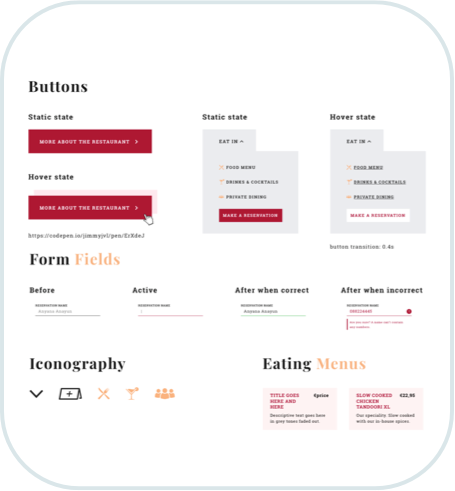
For me, designing the different states of interactable elements is a must in these kind of projects. Every single state of buttons and input fields of forms should be thought of.
Formfields are grey bij default. When empty or incorrect input, the border turns red or green when correct input.
Design never ages. It should change constantly and adapt to users’ needs in that period of time. The booking engine made room for one button saying ‘make a call’, which users seem to like better than filling in a form.
The website of Naan Bar Valletta was a very fun project. I like creating rules & principles so design doesn’t age.
Setting the whole online style was also fun to do and it’s cool to see the difference of the end product and the very first wireframes.
All content on this page belongs to Naan Bar. View their current website here and make sure to visit the restaurant when you’re in Malta!