Eat Sleep Recover is a personalised nutrition and peak performance program focused on improving your lifestyle. It was up to us to take this program to the next level by optimising both their landing page and the user dashboard. Through a usability audit we did, we found some problems that users experience when on the platform.
• user experience audit
• user observation & interviews
• information architecture & user journeys
• wireframing
• visual design
• developer handoff
During the period where we observed users interacting with the platform, most of them were having issues with finding the information they were looking for. Another thing that we observed was users dropping out because they were regularly prompted to upgrade to a paid plan.
The testing sessions were quite detailed too. The participants all live in the US and have an average web experience. We gave them scenarios and objectives to carry out to see how they’d do it.
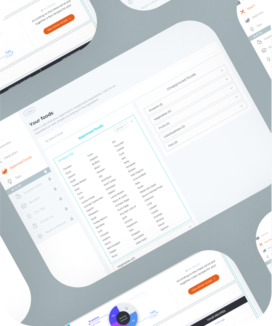
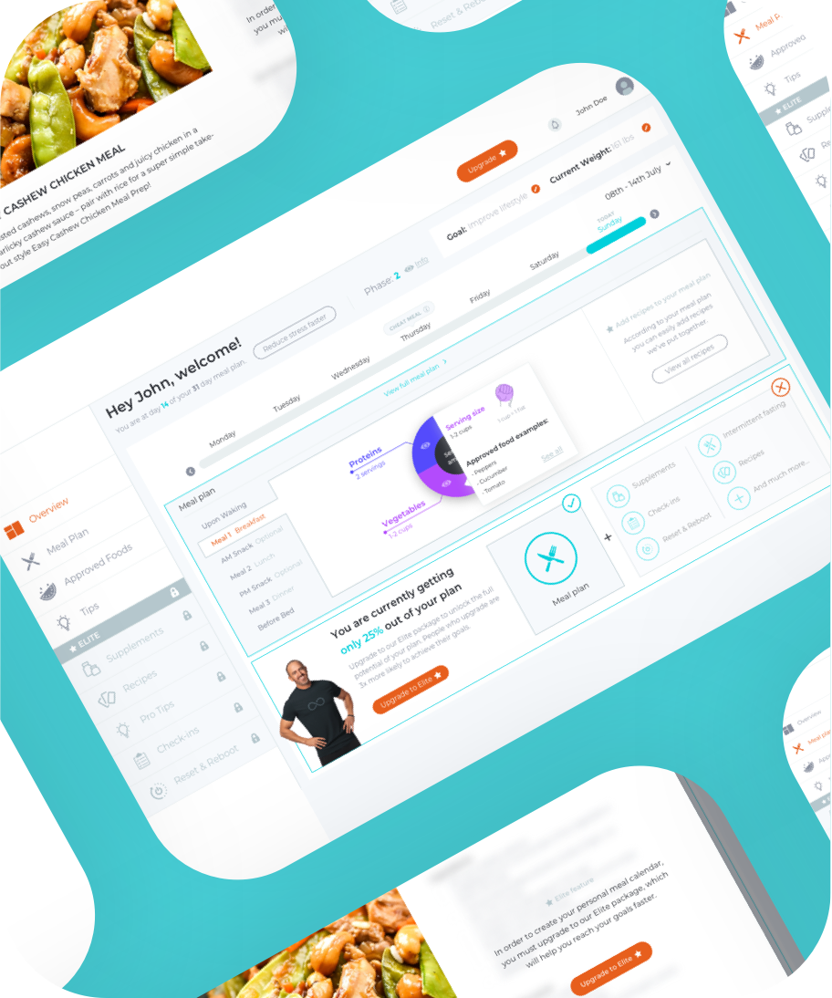
The current dashboard wasn’t completely useless. In fact, we also observed elements that were actually working really good so there was no need for a change there.
We decided to keep the top navigation, the left tab menu and the way the layout of the dashboard is built. A reason for that is that we don’t want confuse current users with a completely different interface.
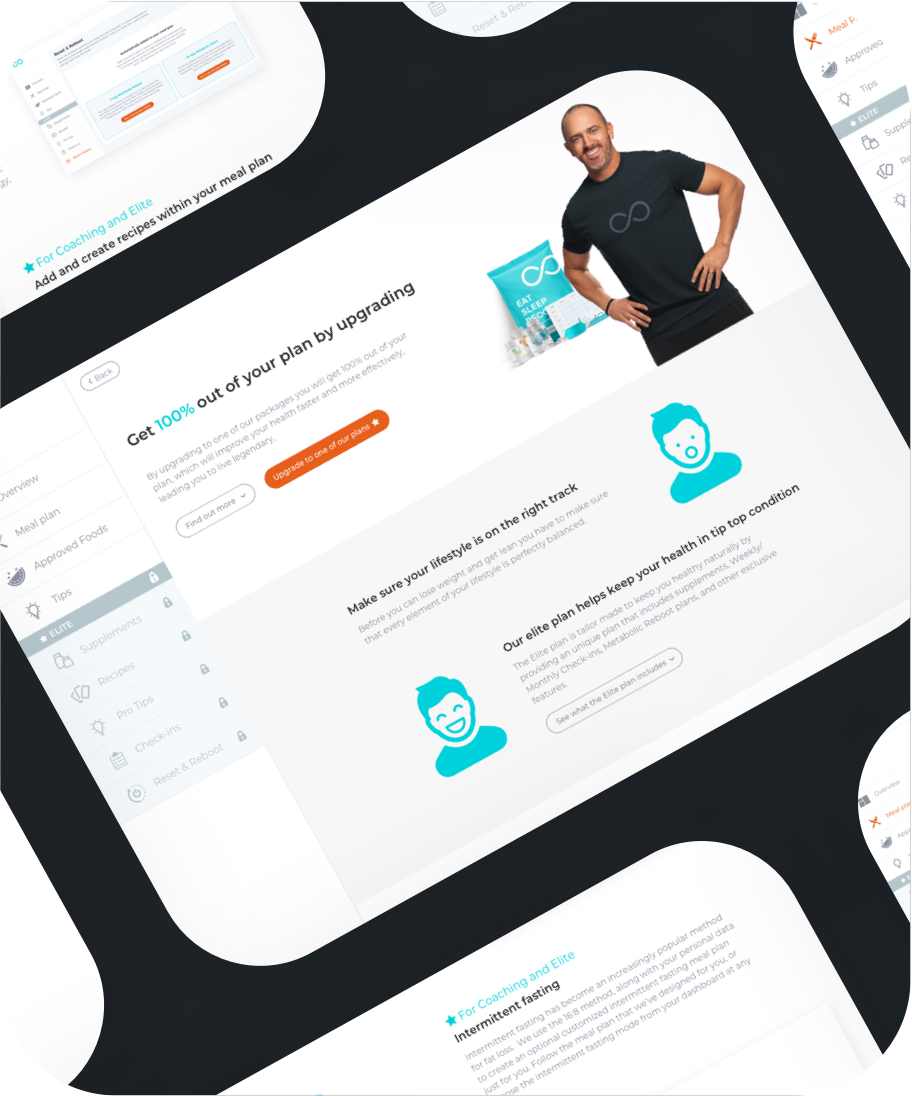
Instead of clearly showing the elemenents you don’t have access to in the free plan, we changed that to new items that you can gain access to when you upgrade to the elite plan.
This plan still exists of the same content as it did before, but with more positive words like ‘new’, users don’t get frustrated by the fact that they don’t have access to those items. At the same time users are more likely to actually upgrade to the elite plan when they can ‘discover’ more information which are to be found in every tab under elite.
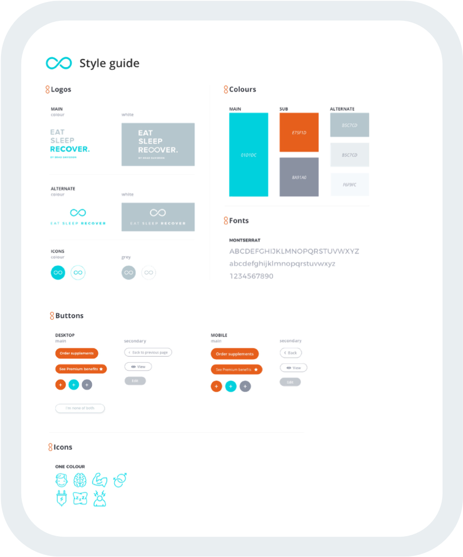
We didn’t recreate the whole visual identity. In fact, we primarily utilised the existing colours, but polished them up to bring more life into the existing brand.
Apart from that, we revamped the iconography style and chose to use a Google font which is both easier for development and easier to read for a larger amount of users.
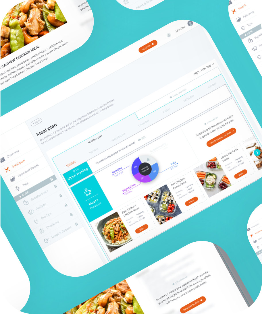
To meet the users’ expectations, we added a lot of functionality to the dashboard that would improve their experience. To name a few: a module tab with the different meals in the meal plan per day, a slider so you’re able to look back to your meals of the days past and the days to come, and a slightly redesigned layout for easier ‘findability’ and navigation.
I really enjoyed working for Eat Sleep Recover. It’s really fascinating to see people making certain choices when you give them a task and then observe their interactions with no right or wrong. Users can now experience a redesigned usable dashboard platform and landing page.
To read more about Eat Sleep Recover, visit the case study on anchovyinc.com or go to eatsleeprecover.com.